Judging a Book by its Cover

My latest romantic suspense series, The Seven Trilogy, came out in 2015 and 2016. The books received great feedback, including a 4 ½ star, Top Pick rating from RT Reviews. They were finalists for several awards, including two Daphne du Maurier awards for excellence in suspense, and a Carol Award. The second book in the series won the Word Award for best inspirational suspense novel in Canada in 2016 and book three won a Cascade Award for best published contemporary fiction.
I was equally thrilled and mystified by what was happening with the books.
Thrilled by the great critical response, and mystified that the starred reviews and awards did not translate into sales. I conducted a poll recently in an effort to discover why. More than a hundred people responded, and about ninety percent told me what I had long suspected, that the problem was the covers.
I love the publishing company that put out this series, and the designer on the team is fabulous, so the fault is mine as they used my ideas and suggestions in coming up with the covers. If I had consulted a marketing expert, he or she would have told me that while the covers were great, they missed my target market entirely. The novels looked more like fantasy or science fiction than romantic suspense, so any potential readers of my genre simply passed them by.
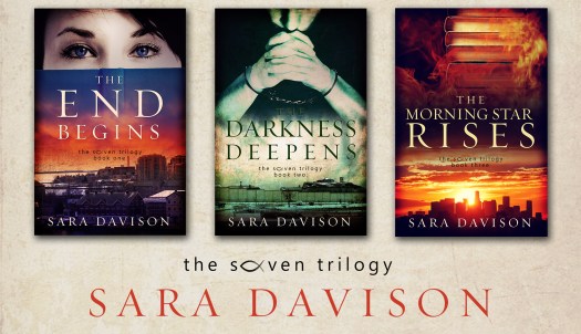
I am extremely grateful and excited to report that the books are about to come out with brand new covers. Time will tell if that makes a difference in sales, but at least at that point I will feel as though I have done everything I can to reach the right market.
We’re told repeatedly not to judge a book by its cover. Of course this directive doesn’t usually refer to actual books, but to situations or people who may not be what they appear to be on the surface. The trouble is, just as readers have been doing with my books, we very often do just that. We don’t open the “book” to see what is inside; we make snap decisions about whether or not we want to read something, or eat something, or buy something, or even get to know another person better based on our initial first impressions.
As a believer, this sobers me. Pondering the situation with The Seven Trilogy has led me to ask myself two questions: Do I make snap decisions, especially about others, that keep me from interacting with them the way God would have me do? And does the way I live my life and therefore present myself to others, draw people to the God I claim to love and follow, or cause them to pass Him by?
My prayer is that, when others look at me—at how I act, speak, and think—my “cover” will accurately represent the Holy Spirit within me. As C.S. Lewis once said, “We must show our Christian colors if we are to be true to Jesus Christ.”
I’m thrilled with the bold colors of my new covers (shown below); may my life, inside and out, reflect always the bold colors that mark me as a follower of Christ.

The Seven Series (1)

4 Things You Can’t Not Know Before You Self-Publish

This post first appeared on Margot’s blog, Wordmelon

Whenever I have a client who’s self-publishing, especially those who are just dipping their toe into the world of publishing for the first time, there is a host of information I want them to know. I can’t communicate all of it, but here’s what you can’t not know:

  1. Editing Process

When a contracted manuscript is submitted to a traditional publisher, the process will typically involve:

  • One or two rounds of developmental editing
  • A round of copy editing
  • Several meticulous rounds of proofreading, looking for the tiniest errors: an extra space after a period, a “zero” that’s really a capital “O,” or a “there” instead of a “their.”

Readers have been trained to expect an error-free product, and even a few errors can cause the reader to lose confidence in the book, and set it down. While this rigorous level of precision isn’t always possible when self-publishing, your readers will be best-served if you put this important work into your book up front.

  1. Book Cover

Whether readers will be browsing through a bookstore, scrolling through thumbnail images on Amazon, or buying from a merch table, the cover matters. It both signals what’s inside and whether what’s inside has value for the reader. Even if you have the technical skills to create a cover using your photo editing software, don’t. Resist the urge. There are tried and true principles relating to images, colors, font styles, and font sizes that make for great covers. Let a professional design the cover of your book.

  1. Book Design

Have you ever noticed that the inside of a traditionally published book, all the pages of content, have been designed? Care and attention have been given to the precise measurements of margins, as well as the size and shape of fonts in the text, chapter titles, headers and subheads. None of this is accidental. Each choice was made to serve the book and serve the reader. Although certain independent publishing options might aid you with book design, it’s up to you to ensure that nothing about the design creates a barrier to a reader reading your book.

  1. Books Are Hard to Sell

Before you sink your own dollars into publishing a book, have a plan for how you will market and distribute the book to your target audience. Don’t just throw it up at Amazon with millions of other books and hope for the best. You’ve been warned.

The purpose of your book is to serve the reader, and a well-written book with a sharp design does that. If it’s worth doing, it’s worth doing well.

The Tale of Two Book Covers

One of the most exciting things you’ll get to do as a published author is decide on your book cover. For a long time, your novel may have just been black words on a white page, but a book cover is the pretty packaging that is used to attract readers and get them to purchase your novel. Several thoughts on marketing/branding become important during this process.

Most publishers will allow you to provide input into the book cover. Before my cover was designed, they asked me for some directions. This is what I provided for instructions.

1. Different from what is normally seen in CBA fiction. Who doesn’t want to stand out?
2. Dark imagery/suspenseful/intriguing: dark colors, creepy feel, etc…
3. Not overtly medical. Above all else– this was most important to me. This may be confusing to some as it is a medical thriller (of which I am very proud!), but the reason behind that direction was that I’m not sure I will always write medical thrillers, and I wanted to reach the wider suspense/thriller audience.

Here were the two choices I had:

When I got these from the marketing director I was stunned! I loved both for different reasons.

Here were some of my thoughts.

I loved the cover with the menacing killer, and he actually looked just like the villain in my own mind. How could they possibly have done that? I’m a risk taker, and that cover definitely appealed to that side of my personality. My first thought was: Even Ted Dekker hasn’t done anything this scary. Can I pull it off? Is it wise to have something this risky as a debut cover?

Why was it risky? Well, this is where some marketing comes into play. The largest segment of book buyers (even for suspense) is women. Is a woman going to pick up the book with the evil, scary dude on the front? If she does, would she keep it in her hands or plop it right back on the shelf. Was it safer– maybe smarter would be the better term– to use a cover that will accomplish what I wanted but still attract those who are most likely to buy the novel?

I was fortunate because I got these draft covers just before I left for the ACFW conference last September and was able to get the opinion of lots of people on which one they liked the most.

There was one clear winner.

Another interesting thing that happened was a couple of people commented on the size of my name on the front cover. I got the sense that maybe they thought I might be “too big for my britches” as they say. I found that sentiment a little fascinating as it certainly wasn’t something I had insisted on but wondered if there was an unspoken code of name size that once you sold a certain volume of books– then your name could be in large print.

Which cover do you think I picked and why? Do you think an author needs to “earn” their name being in large print?

Click here for the answer and leave a comment here and at Redwood’s Medical Edge. I’ll be drawing a winner from the comments section of both blogs for a copy of Proof!  Drawing will be Saturday at midnight, April 7th. Winner announced at Redwood’s Medical Edge April 8th.

Cover Art by the amazing Nick Richardson.

%d bloggers like this: